This is a test project I created for a pretty heavy interview process. I think the results are worth sharing, even if it will never go to production. I found the brief very interesting. It explored a device I was not used to considering as a primary viewport, so it came with lots of learnings, and I love a good challenge. It also allowed me to think strategically about the methodologies I'd use, how I could get real input to validate assumptions, and which items would need to remain hypotheses to make decisions.
This is what I can achieve with a design brief, a weekend of intense work, and a jumbo box of Frosties. If you are curious, I passed the test.
This is what I can achieve with a design brief, a weekend of intense work, and a jumbo box of Frosties. If you are curious, I passed the test.
The team:
Me, Myself and I as a product and brand designer
Me, Myself and I as a product and brand designer
The Challenge
"Design a tablet application where children from the ages of 6-14 can stream their favorite tv and movie content at any given time. Try to incorporate all of the vital components that such an app should entail from both children and parents.
We encourage you to take into consideration additional features that would take this concept to the next level."
There was also a time constraint: I shouldn't use more than 12 hours, and the focus would be on my UX and UI skills. I could choose to balance the percentage of each as I saw fit.
There was a lot of room left for interpretation on the brief - on purpose, I suppose. I first broke down the facts and made some crucial decisions to know where to focus. Here are my considerations and assumptions:
Business needs:
Business needs:
My first question would be to understand why the company decided to build this particular product. I know business constraints in a natural environment affect the possibilities as much as user needs, like company size, timeframes, budget, OKRs, etc. I will assume the following:
- This is a new company in the streaming business, a child company inside a big media organization new to the digital space looking to capture a new audience
- Their goal is to launch an app that can compete with players like Youtube Kids
- The expectation is an MPV that can cover children and parent's main needs and stand out in the market.
- The design team would include a UX researcher and product designer (my role)
- I would like to know what goals the company has in terms of revenue and what KPIs they find essential to be able to measure results
Market and user data:
Market and user data:
To understand the user and make a relevant product, I would have requested or expected information about the context of use:
- Language and geography: My assumption is to aim for a US-targeted app in English
- Cost: My assumption is a premium app on a +USD 10/mo subscription service
- Demographics: Oriented to young professionals with kids ages 6 to 14
Brand and content assumptions:
I will create a name and logo and assume it was provided to then create brand guidelines for UI elements, illustrations, icons, image use, and fonts. I will provide illustrations as guides that could be used as briefs or art direction. Illustration and branding are not the final objectives of this project.
Content is indeed king on video streaming apps. I would suggest a specialist supports the design team. I will create a placeholder copy and use real text whenever possible.
Deliverables:
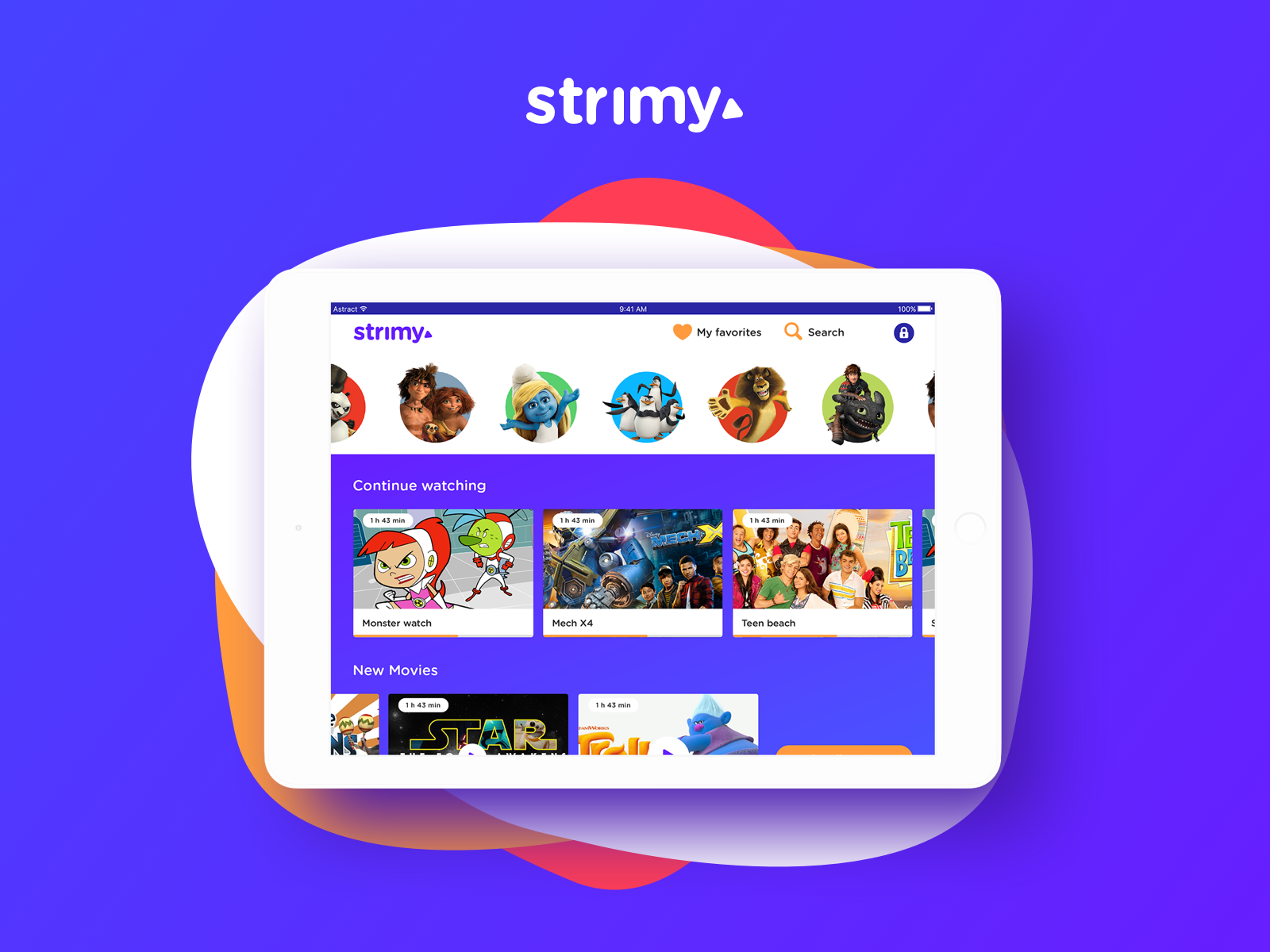
I will assume a design system is not needed for timing purposes. Still, I will create documentation and work in Sketch in an atomic manner to ensure scalability, consistency, and easy handovers. My final deliverable will be the prototype in InVison.
Research and modeling:
I had room to assume the why the company wanted this app and some context on the market, so my next step was to uncover the who and their context. I will assume I received data from a UX researcher to create two protopersonas:
- A parent, buyer persona: A 31 year old tech savvy parent or guardian, digital and content-safety conscious.
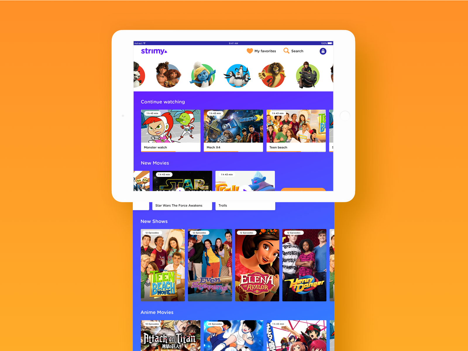
- A child (6 to 14 years old), user persona: I'd argue that the range is too large. Kids in these ages have very different cognitive abilities. I will continue with the proposed range, adjust the features to include both, but will deliberately choose to make it for children 6-10 primarily. This persona enjoys playing with toys from the tv series they watch. They love to play on their tablet and takes it everywhere.
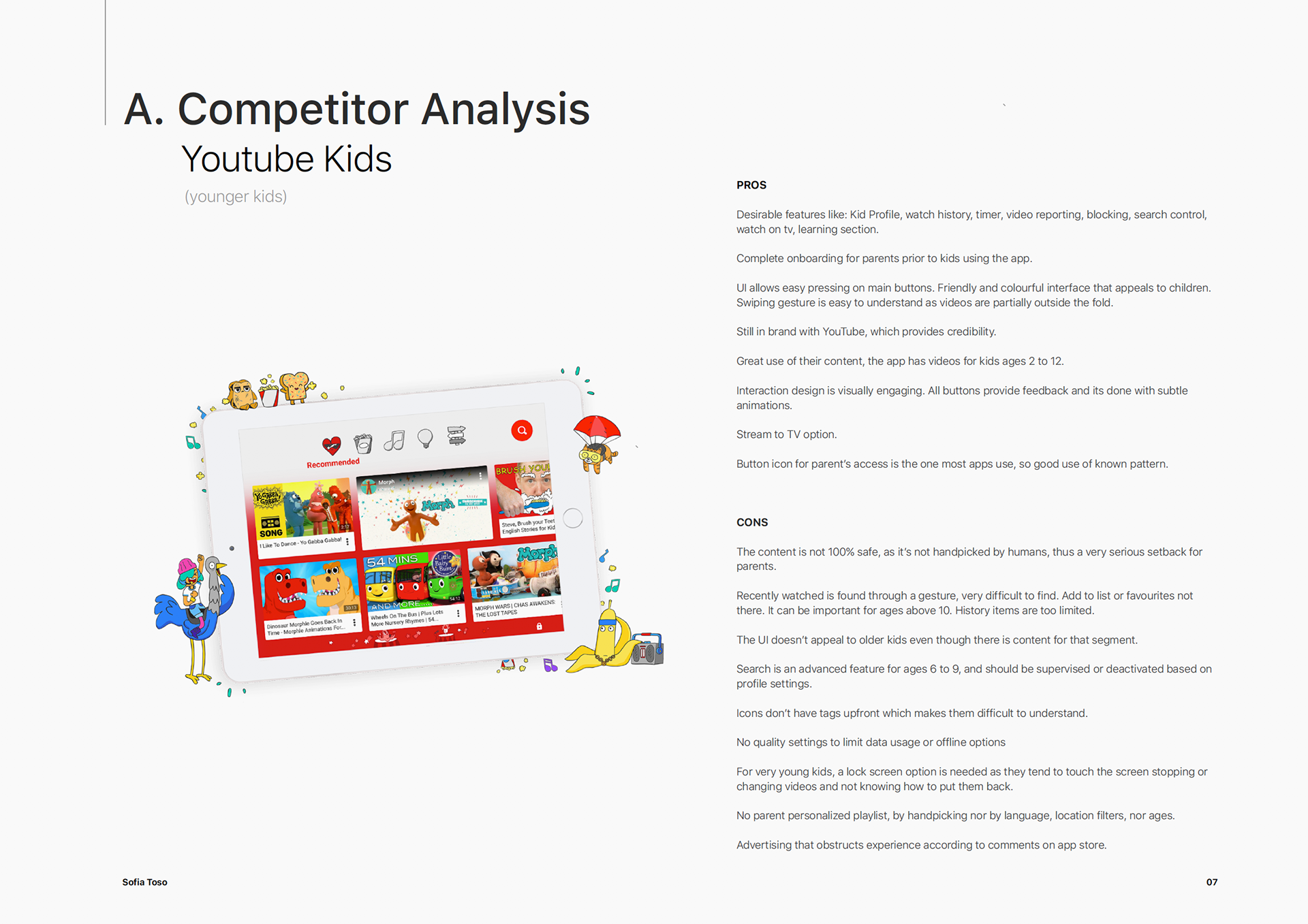
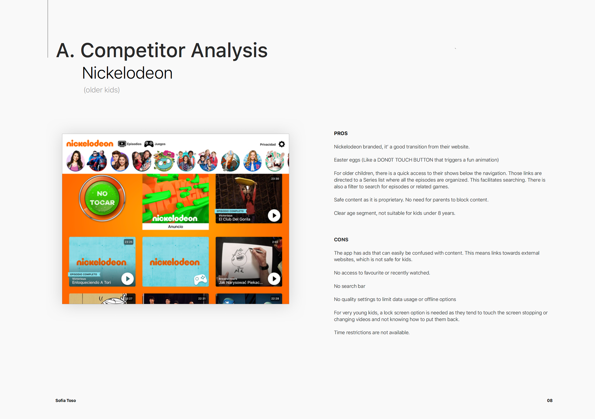
Competitor Analysis:
One of my favorite ways to uncover user pains, attitudes, and emotions is to read comments online, especially when I'm on a tight budget. I also use that data for the competitor's analysis; I created the document from the user's perspective. To complete the study and find must have features and items to improve, I used one of the apps and performed a high-level UX heuristics review.
Requirement definition:
I would typically have a workshop with the team for an affinity mapping exercise based on interviews, competitor analysis, and other raw data. Due to time constraints (and small accurate user data), I tried something different.
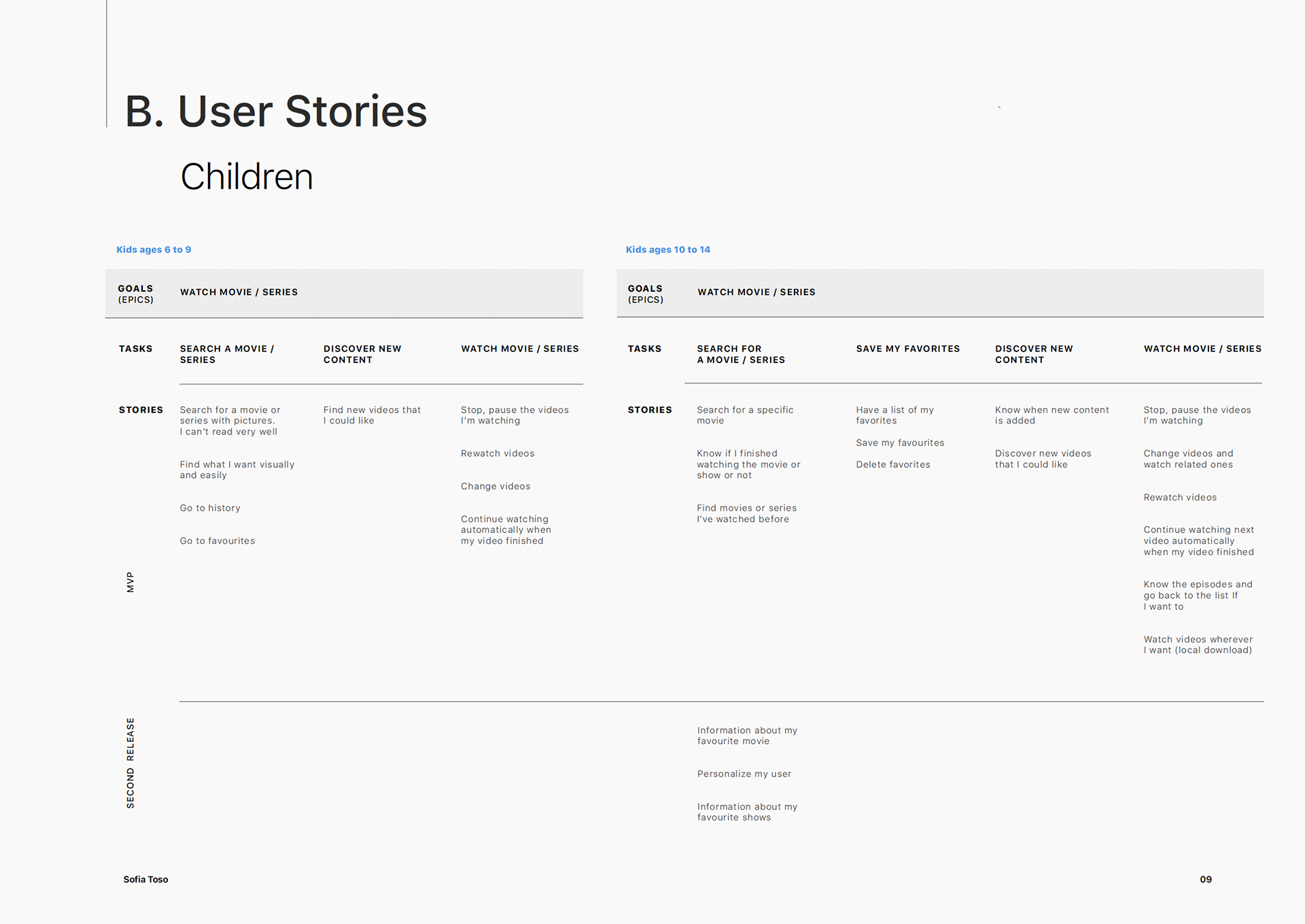
User journeys and stories
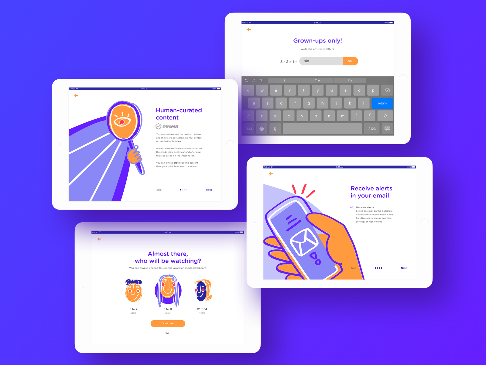
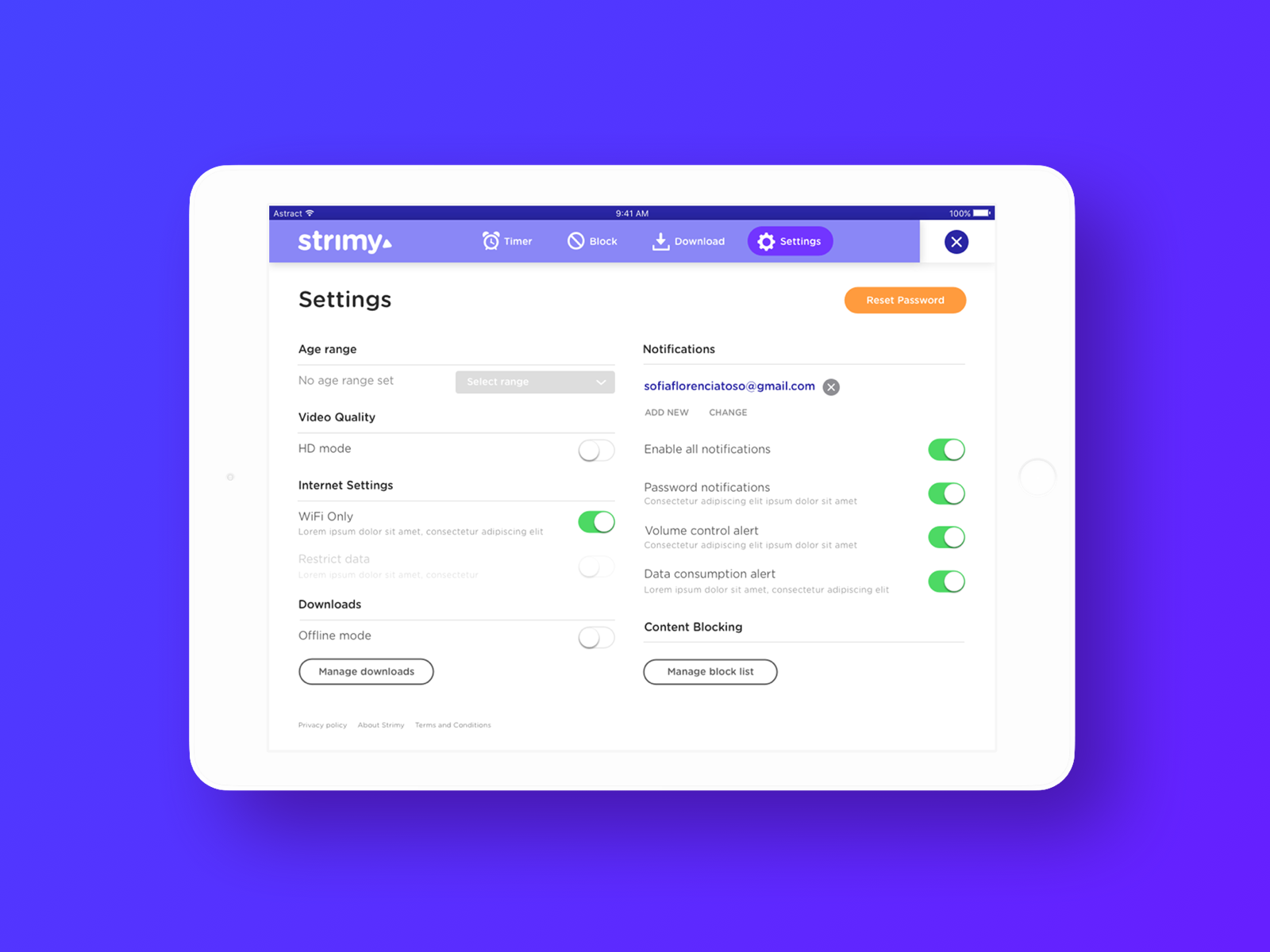
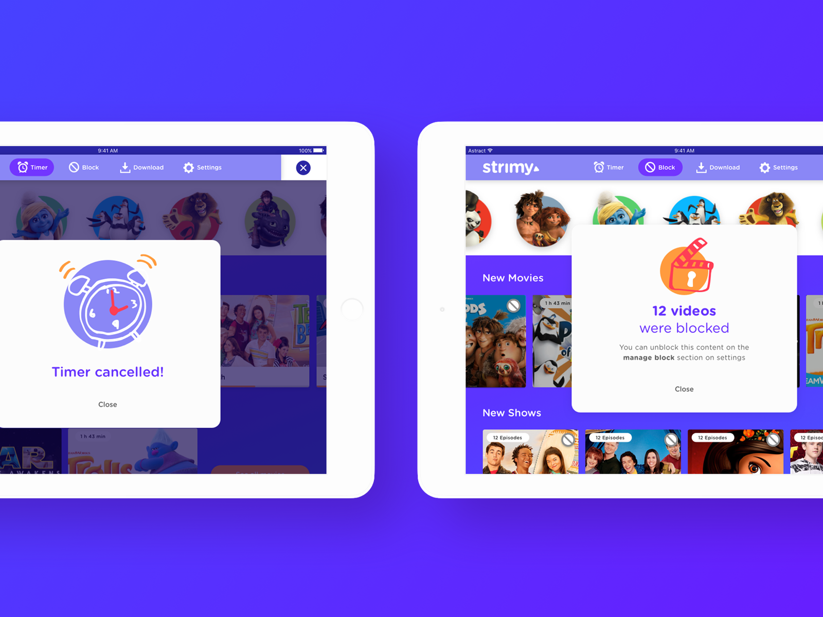
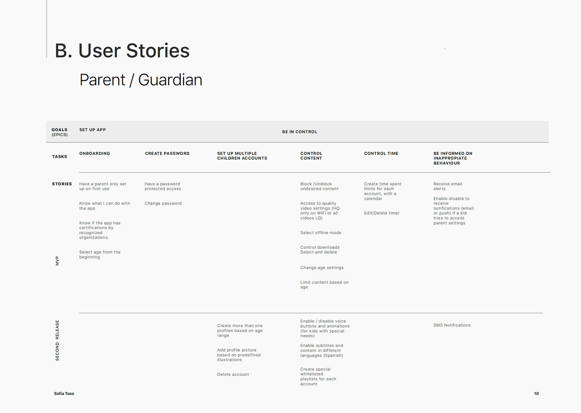
I identified that my parent persona journey would start after Activation and First use to focus on the solutions I could include in the MVP. Based on the research, I knew the first barrier would be to convince the parent to continue using this service (retention phase) and by keeping the children them engaged while providing a feeling of safety.
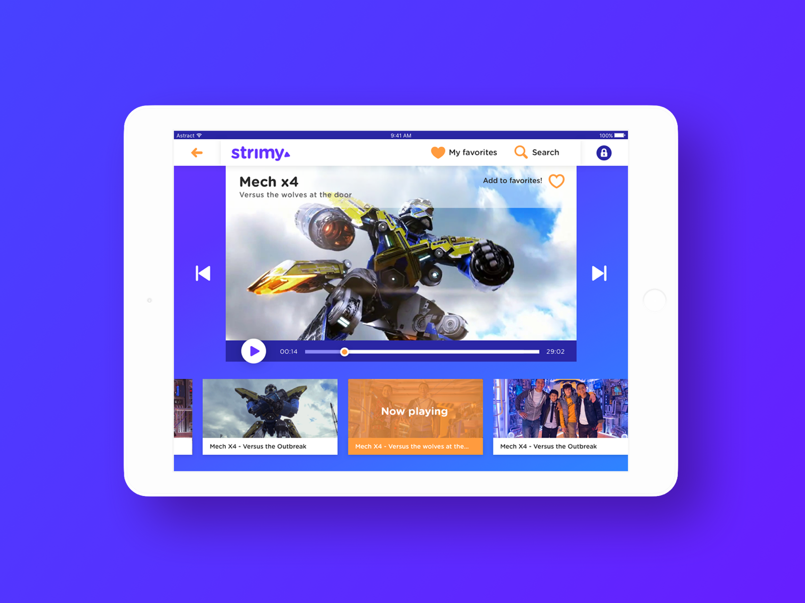
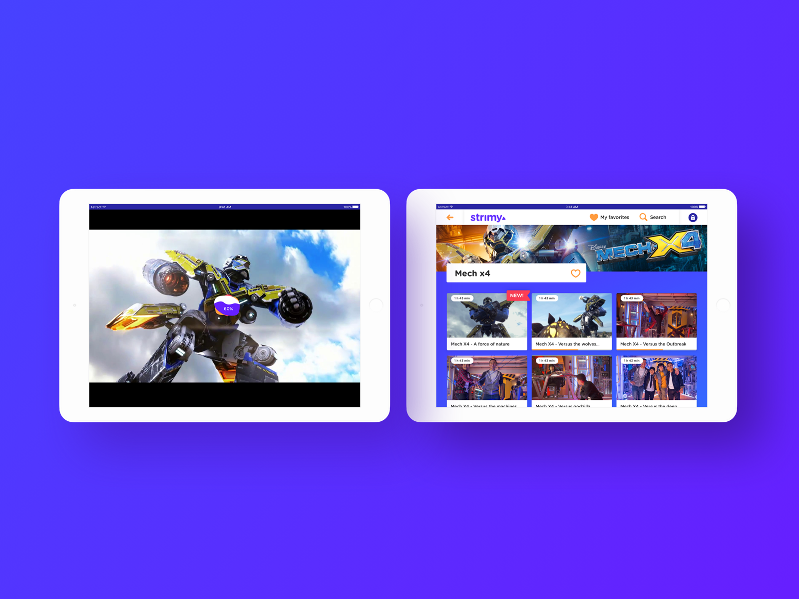
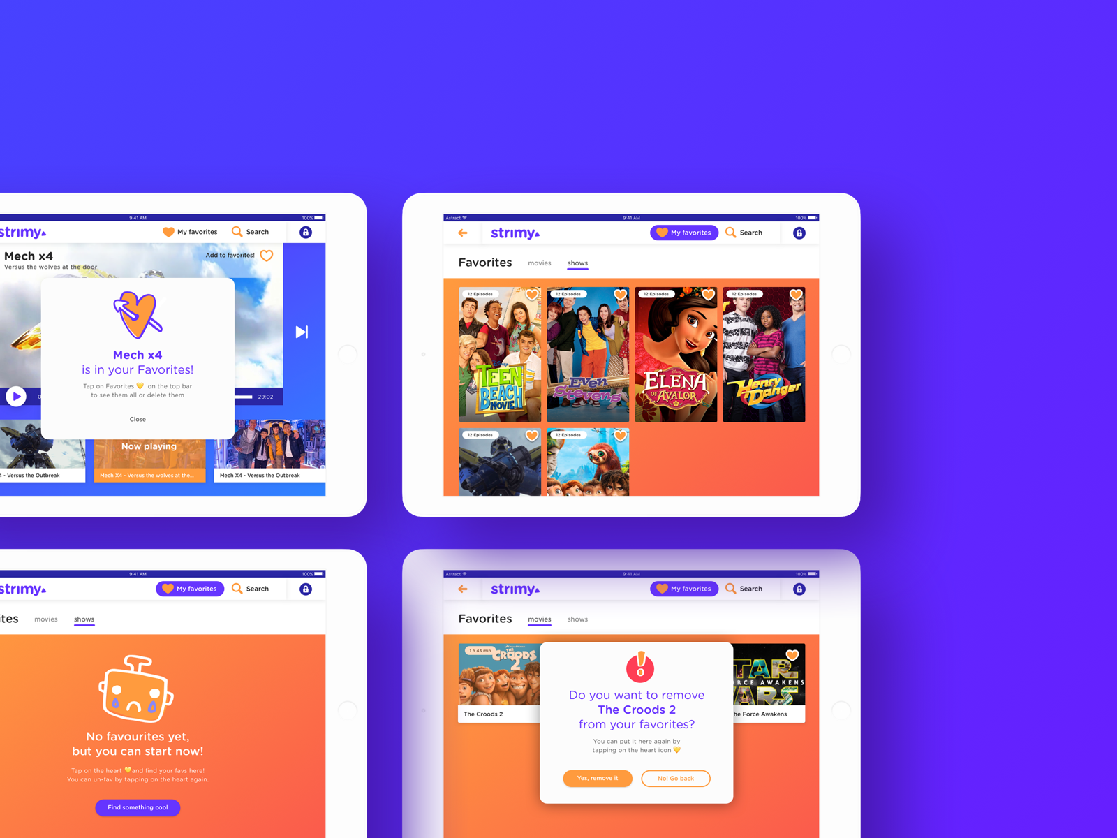
I used the research data to find the critical flows for my app (epics), recognized tasks inside them, and wrote them as user stories (features). I separated the epics into two age ranges for the children as I want the app to be applicable for both. I assume that older kids will want to save their favorites to continue watching later. Instead, younger kids would choose something from a list regardless of what they saw last. Their journey will start after the parent sets up the app.
I used the research data to find the critical flows for my app (epics), recognized tasks inside them, and wrote them as user stories (features). I separated the epics into two age ranges for the children as I want the app to be applicable for both. I assume that older kids will want to save their favorites to continue watching later. Instead, younger kids would choose something from a list regardless of what they saw last. Their journey will start after the parent sets up the app.
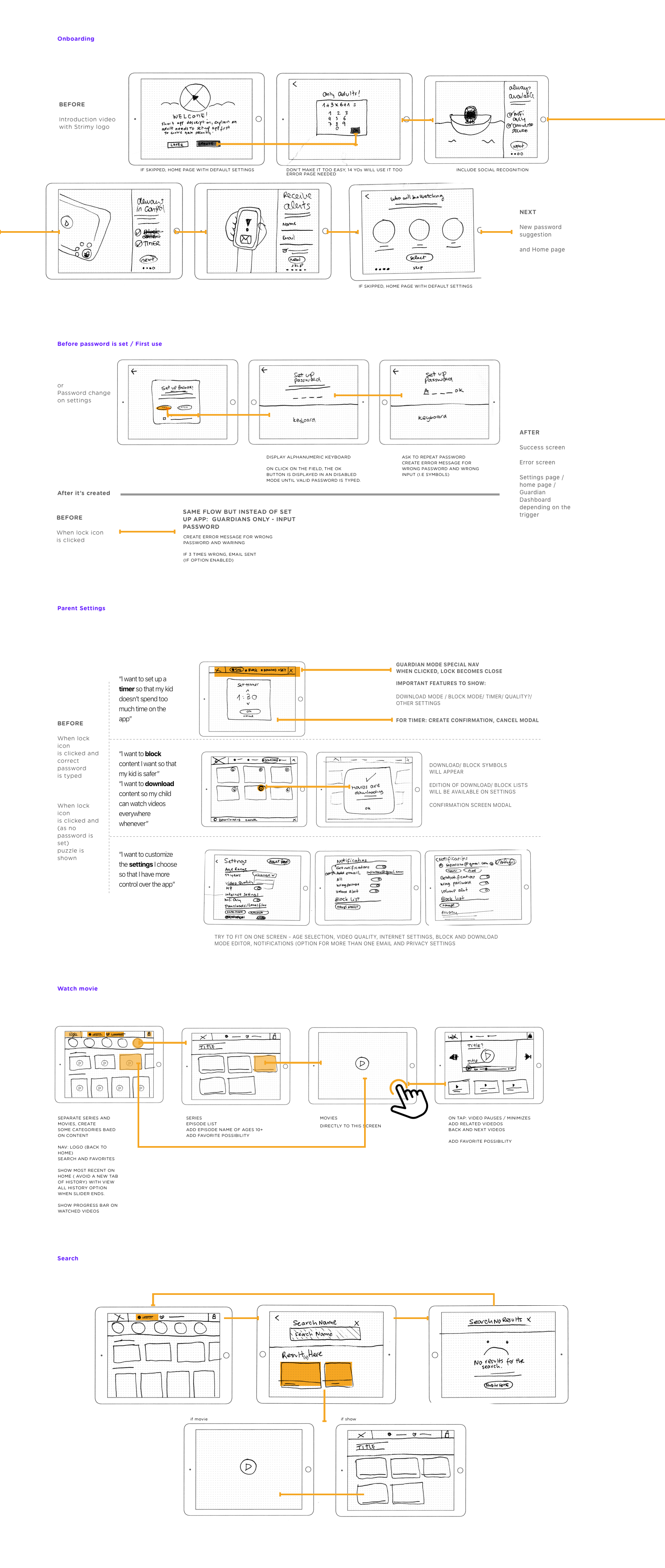
In order to finish the project on time, I needed to cut my usual process short while managing to get the same amount information and decisions. I mixed the insights from the user journey and storymapping with wireframes. I draw the scenarios and imagined the user's steps on the screen at the same time. I digitalized the images, polished some areas to have a clearer view, and annotated my thoughts for edge cases, behaviors, states (you can see that on the images below). I would have created a dedicated set of low-fidelity wireframes to test early on in a typical process, but found out that this combination was a time saver and gave me lots of ideas.
Brand and visual design
I had to pause here. It was already too much for day one.
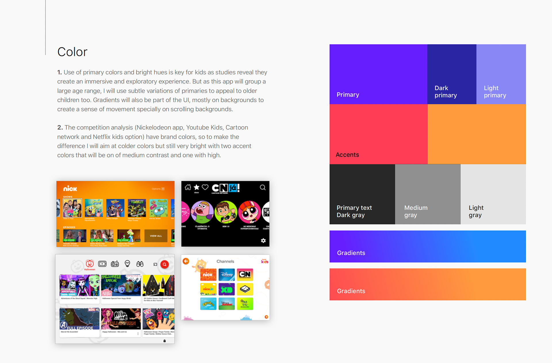
Day two started with the following question: Now that I know who the users are and what they need, can I create a brand that reflects my findings? Here are the results. It was a rather quick exercise, an excuse to discover some limitations for the upcoming UI design.
Day two started with the following question: Now that I know who the users are and what they need, can I create a brand that reflects my findings? Here are the results. It was a rather quick exercise, an excuse to discover some limitations for the upcoming UI design.
UI design
I had made the following assumptions and researched data to take some decisions before I started:
- Hybrid or native: I suggest the MPV is a native IOS app. Native apps are safer and perform better
- They can be used without a Wi-Fi connection (the app needs to be accessible offline)
- User is from the USA, where IOS has over 75% market share (1)
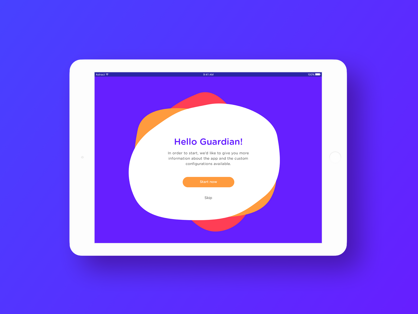
- The UI will not use IOs guidelines; as it's a children app, it needs a different look and feel (bigger targets, different menu styles, colors fonts, and more feedback)
-The app will be landscape only. It is the usual way to watch videos due to its inherent ratio.
- The most common size is 1024 x 768 px (59% of users). It will be responsive in that ratio, but I won't adapt on rotation for portrait mode in this exercise. (3)
Source: (1) http://gs.statcounter.com/os-market-share/tablet/united-states-of-america, (2) http://gs.statcounter.com/screen-resolution-tats/tablet/worldwide,