Creating an eCommerce experience for Maruja
2020 Volunteer project UX UI Design
As a remote-based designer working for an eCommerce SaaS, I felt safe in a thriving business during the pandemic. But many small local businesses I knew were going through some of the most challenging moments in their existence. I could lend a hand.
I chose to support Maruja, an accessories brand I knew from Buenos Aires, and joined forces with software developer Patricio Ferraggi Ares. We wanted to provide Maruja with a web-shop and branding material to promote the brand, attract clients and make it through the pandemic. We took this chance and asked our friends Camille and Manuel to join us. We were helping them gain more experience in design and development respectively, so what a great opportunity we had!
The team:
Patricio Ferraggi Ares: Software Developer
Manuel Aceituno: Software Developer
Thanh-Hông LÊ (Camille): UX Designer and Researcher
Sofia Toso (me): Product owner, Product Designer
The timeframe
We finished the design phase in 3 months (as a part-time effort)
The team:
Patricio Ferraggi Ares: Software Developer
Manuel Aceituno: Software Developer
Thanh-Hông LÊ (Camille): UX Designer and Researcher
Sofia Toso (me): Product owner, Product Designer
The timeframe
We finished the design phase in 3 months (as a part-time effort)
About the company and goals:
Maruja is an accessories brand inspired by Maria Mahia, the founder's grandmother. She was a fun woman who always thought you could add a little something extra with a simple accessory. The brand operates in Buenos Aires, and the primary revenue channel is direct sales via social media. This model means the seller needs to handle the stock, product updates, and support manually. It also involved a lot of work from the delivery side (buy and collect model or personal delivery). Customers love the personalized buying experience and quality/price product relation.
They need to migrate the primary sales channel to manage everyday business more efficiently while positively affecting revenue. Our success metrics for the project are to increase conversion by 25%, reduce cart abandonment to a 75% rate, and, secondarily, increase average order value.
The pandemic accelerated the need for change, as the primary delivery method was no longer viable. Users could no longer see the products in person, and there was an opportunity to harness eCommerce's power beyond social media.
The challenges
Maruja had some challenges to overcome, and so did we as product leads if we wanted to help the business succeed in a competitive industry during a pandemic.
Branding and social media presence:
They were just not competitive or eye-calling enough in the sea of brands in Instagram. Customers discovered the products by word of mouth. They came back because of the product quality, price, and personalized purchasing experience, but it was hard for the brand to attract new customers and engage with them.
Webshop experience personalization and budget:
Maruja had a shop from Tienda Nube, a service like Shopify used in South America. This shop allowed the brand to have a simple template-based design, basic payment options, and no developer involvement. Of course, it's a good idea for a starting brand, but the purchasing experience was not optimized for the needs of a brand like Maruja. We also had to keep in mind that Maruja needed to be self-sufficient after delivering the website and brand assets.
Maruja had a shop from Tienda Nube, a service like Shopify used in South America. This shop allowed the brand to have a simple template-based design, basic payment options, and no developer involvement. Of course, it's a good idea for a starting brand, but the purchasing experience was not optimized for the needs of a brand like Maruja. We also had to keep in mind that Maruja needed to be self-sufficient after delivering the website and brand assets.
The maintenance costs from Tienda Nube were growing more than the company made. Our budget for maintenance was USD 5/month. This ruled out other options like WooCommerce, Shopify, or any out-of-the-box eCommerce platform. If you think this is totally ridiculous, remember, we are talking about a start-up company in Argentina, where inflation and taxes on foreign currency end up eating small businesses' revenue. The developers had to keep costs to a minimum and use the tools available regionally or free.
Using the customer's purchasing go-to choice:
MercadoLibre is the Amazon of Latin America. Users know how to use it; it's easy, safe, and trusted. This company has its own payment platform called MercadoPago, which supports most credit cards, direct transfer, and even payment in monthly instalments (one of the most popular methods). We had to incorporate this checkout flow into our product.
MercadoLibre is the Amazon of Latin America. Users know how to use it; it's easy, safe, and trusted. This company has its own payment platform called MercadoPago, which supports most credit cards, direct transfer, and even payment in monthly instalments (one of the most popular methods). We had to incorporate this checkout flow into our product.
Since we are on a pandemic, the buy-and-collect delivery format didn't work for the brand anymore, and it was the most important. A new delivery method had to be set up technically on the website, but we also had to think about the presentation. Maruja's customers' purchasing mental model involved seeing the product before purchasing, talking to a person directly, and immediacy. We had to gain their trust.
The solutions
Faster impact with a new social media presence:
The brand update was the first task to tackle for me as it would immediately impact the Instagram page - and primary sales source. I took on this branding project as I'm a graphic designer by training and I still enjoy the different experimentation processes this allows. I gathered market data from competitors and went through Maruja's Instagram page to identify potential personas. I also interviewed the founder to understand the values she wanted to share and why Maruja existed. We had a workshop based on brand discovery exercises I created, which has helped me understand a brand's goals numerous times.
After I had all the data and her input, I created two identities so the founder could choose. Both were rooted in values like optimism, simplicity, and her grandmother's story. Each option had a logo, a color palette, typography, and applications.
Since I want to focus on this project's product design aspect, I won't go too much into detail. Feel free to check out some shots in Dribble to see more.

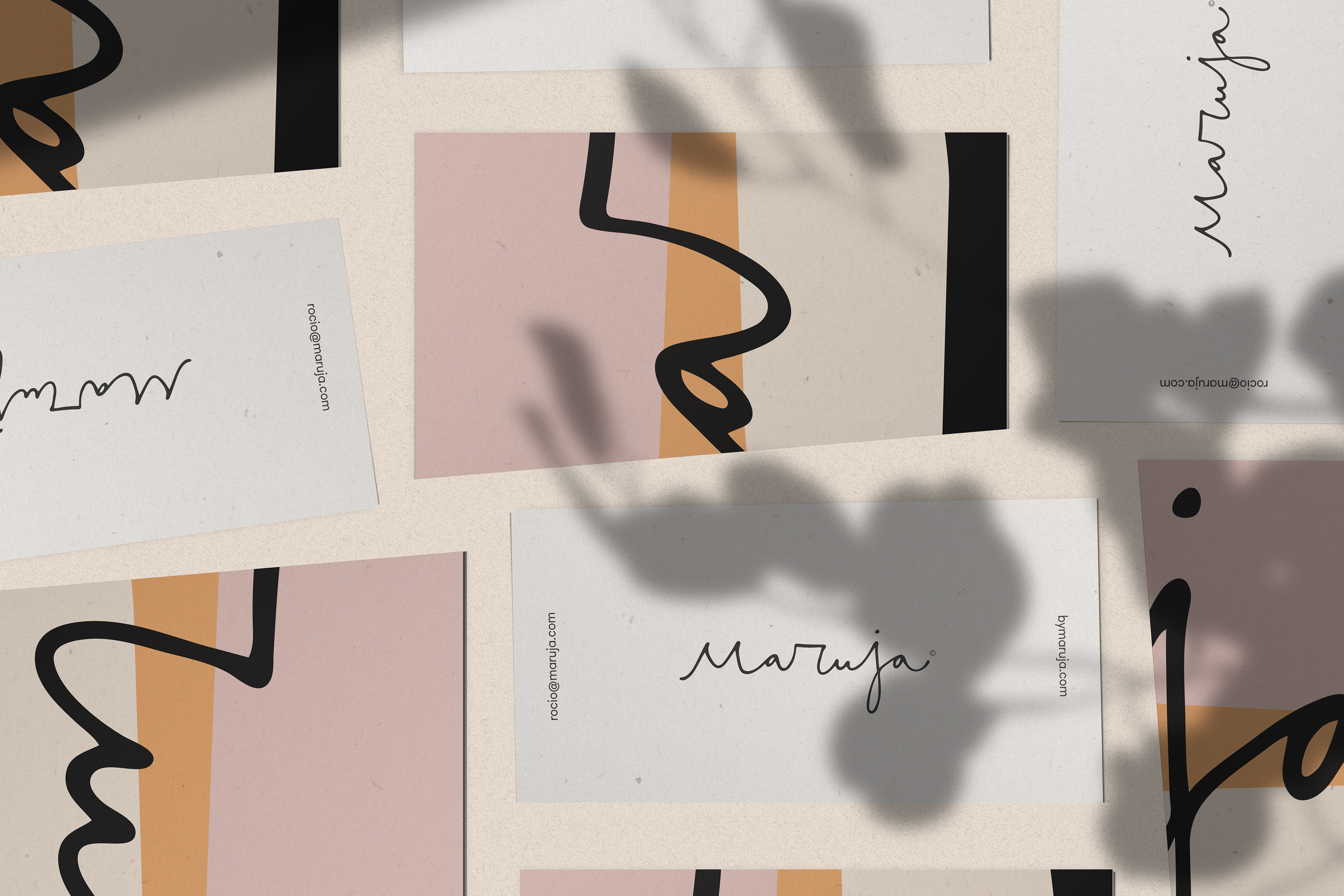
Brand applications in postcards, they reflect the sensitive yet strong and simple brand values.
Webshop experience:
While I worked on the branding side, the developers were wracking their brains to find viable (and on-budget) hosting, CMS, and payment solution. That quest resulted in a fantastic mix of new technologies. We were going for a custom website built in React using Next.js (a huge plus for the UI possibilities), Vercel for hosting and Sanity as a CMS. We would use Mercado Pago as payment provider and Mercado Envios as the shipping service (research supported these choices, as users felt comfortable with both, more on that later).
If you want to learn more about how the developer team came up with a stack that allowed us to stay on budget, check out Patricio's article.
Setting up the project:
I took the role of product owner and prepared a Notion document to keep track of our tasks. As I mentioned before, I partnered with Camille, an amazing product designer I have the pleasure of helping in her design journey. She's a super-fast learner and one of the most passionate designers I've ever worked with.
We worked closely with development on the same Notion project to be aligned on time and deliverables. I planned the steps and methodologies, and we divided to conquer. Camille would focus on the research, modeling, and wireframing areas. I would support her with planning, feedback sessions, and facilitating workshops and interviews. I would, later on, focus on the interface design and handover.
1. Research phase
We knew the output was a website, but we didn't know the how and what yet. Our tasks were:
• Interviewing Maruja's users: We conducted 4 interviews via Zoom and analyzed survey results. I scouted participants based on the user's description from the founder. This was crucial information to use in the modeling phase, and Camille did a great job debriefing the interviews.
• Competitor analysis and Maruja's SWOT analysis: We used these findings to see how more experienced brands were succeeding and how we could be different. One essential result was the validation of using Mercado Libre and Mercado Pago and the strenght in Maruja's personalized offer.
• Visual exploration: I started exploring interface design possibilities to adapt the branding guidelines to digital assets.
We used the Branding workshop and the founder's interview to match the business needs with the user's expectations and desires.
2. Modeling
With the hard data on our hands and debriefed, Camille focused on modeling the information. We had design reviews to fine-tune them until we were happy with the results.
• Creating personas: We found two buying personas by dividing our findings into segments by behavior. Camille did an excellent job at making them look realistic and full of valuable details. Our primary persona was Maria, the effortless. Her goal is to find accessories that fit her multiple activities, making her feel beautiful at all times. She will buy from trusted sellers only, and the price must be right.
• Creating the primary persona's journey map: We found critical moments we wanted to tackle in the MVP. In the Consideration phase, we learned users would always ask for a friend's opinion and advice. We also confirmed our assumptions on the Service and Support phase: so far, the communication was excellent with Maruja, but now that the primary interface would change from Direct Messages in Instagram to a webshop form, we had to make sure to keep the high standards.
• Writing scenarios: I wrote scenarios to understand the context of use.
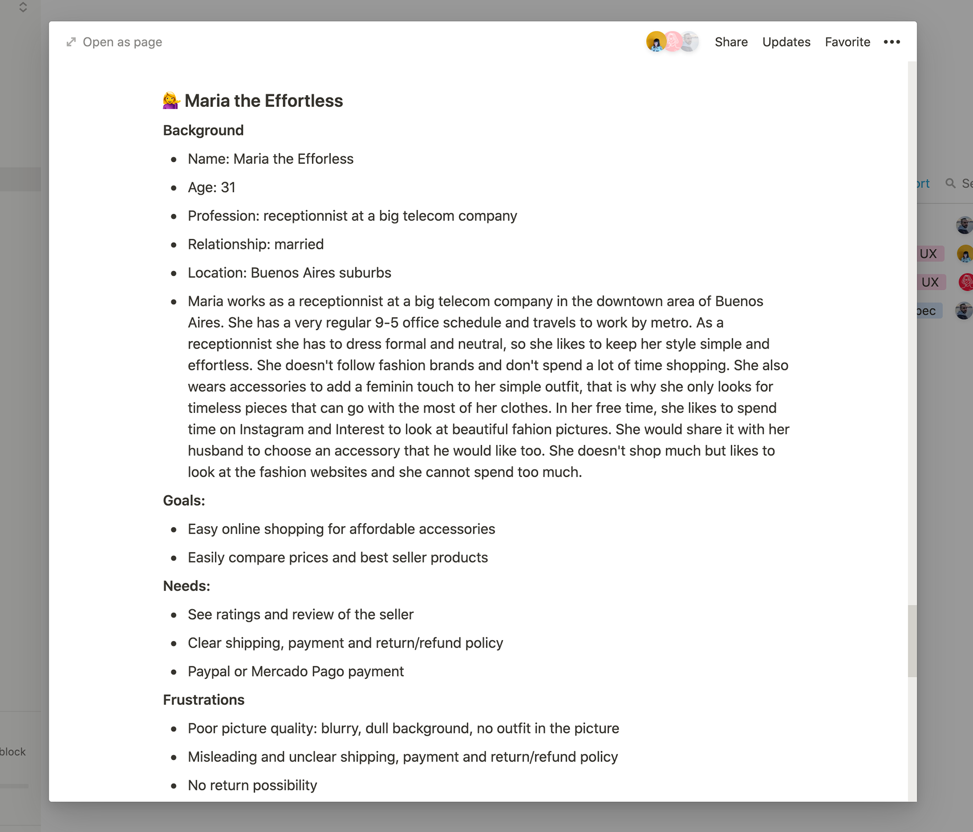
Persona document: Camille used the information from the interviews to create the persona. We used Notion for a faster iteration/review process. It was also the right complexity, as we were all working here, we didn't need a poster or extra work.
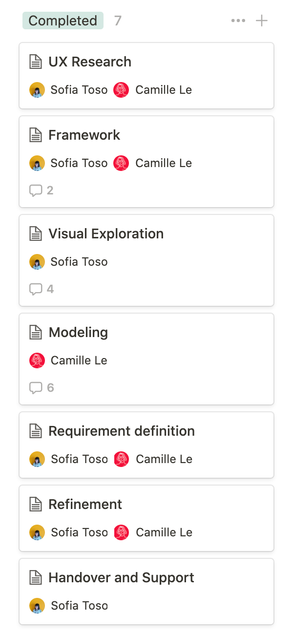
Our epic's backlog, luckily, all in complete. We used Notion to track our progress and save all the documents and links in one place.
3. Design requirements as user stories
With a clear picture of why we needed to improve the online buying experience, who the users are, and when and where our product would help them, we could find solutions and prioritize ideas. We did that in a remote workshop in Miro. We started to see patterns, mapped and grouped them into categories. We compared the results with the brand's current state to only focus on the high value and low satisfaction quadrant. We used this exercise to learn:
• How might we help users find the right items?
• How might we help users feel confident about their purchase?
• How might we overcome the change from a direct platform to a company shop in terms of support?
• Where do persona goals meet business goals?
The outcome of the session helped us outline:
• Site's information architecture
• The primary user stories to cover in an MVP
• Delight stories for the next iterations
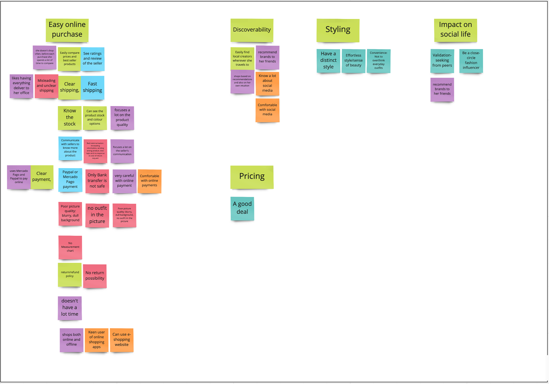
Affinity mapping of the results during online workshop: This was transformed into the project's navigation and main content blocks. We included the SWOT analysis points to show opportunities to highlight and weaknesses to overcome (image to the right) and how might we's.
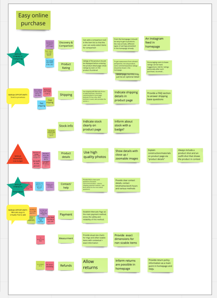
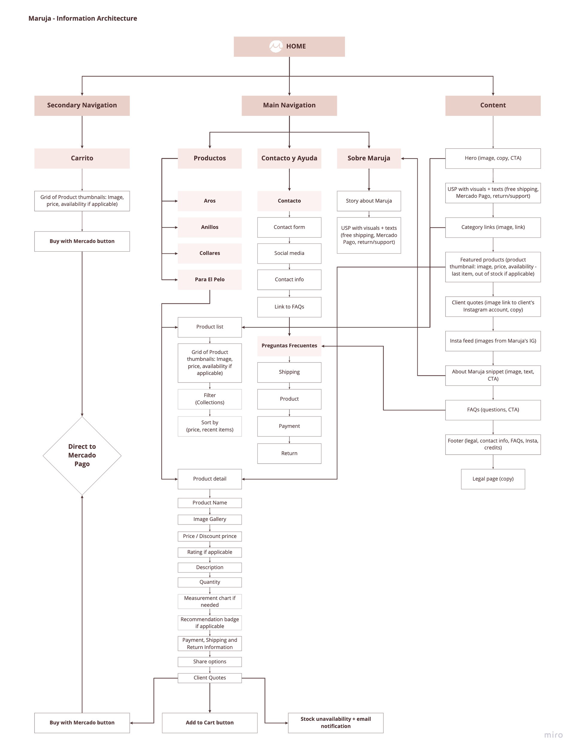
Based on the workshop's results, we diagrammed the AI and the components for each page. Camille developed this map that clearly shows the content of the page.
4. Wireframing and testing
Camille created the wireframes to test the ideas we obtained during the requirements workshop. I supported her with feedback and candidate management.
We had most of the components a traditional eCommerce website has, but we knew which we needed to amplify and what the hierarchies should be. Our research also helped us with the copy: we could target our message more clearly towards safety, confidence, social proof, and personalized support.
From conducting usability testing on the wireframes, we learned we needed to shorten the homepage, fine-tune the navigation in hierarchy and remove extra information that would be acceptable for users to have on a second level. On the positive side, we were on track with the social validation and the users succeeded in completing all the core tasks.
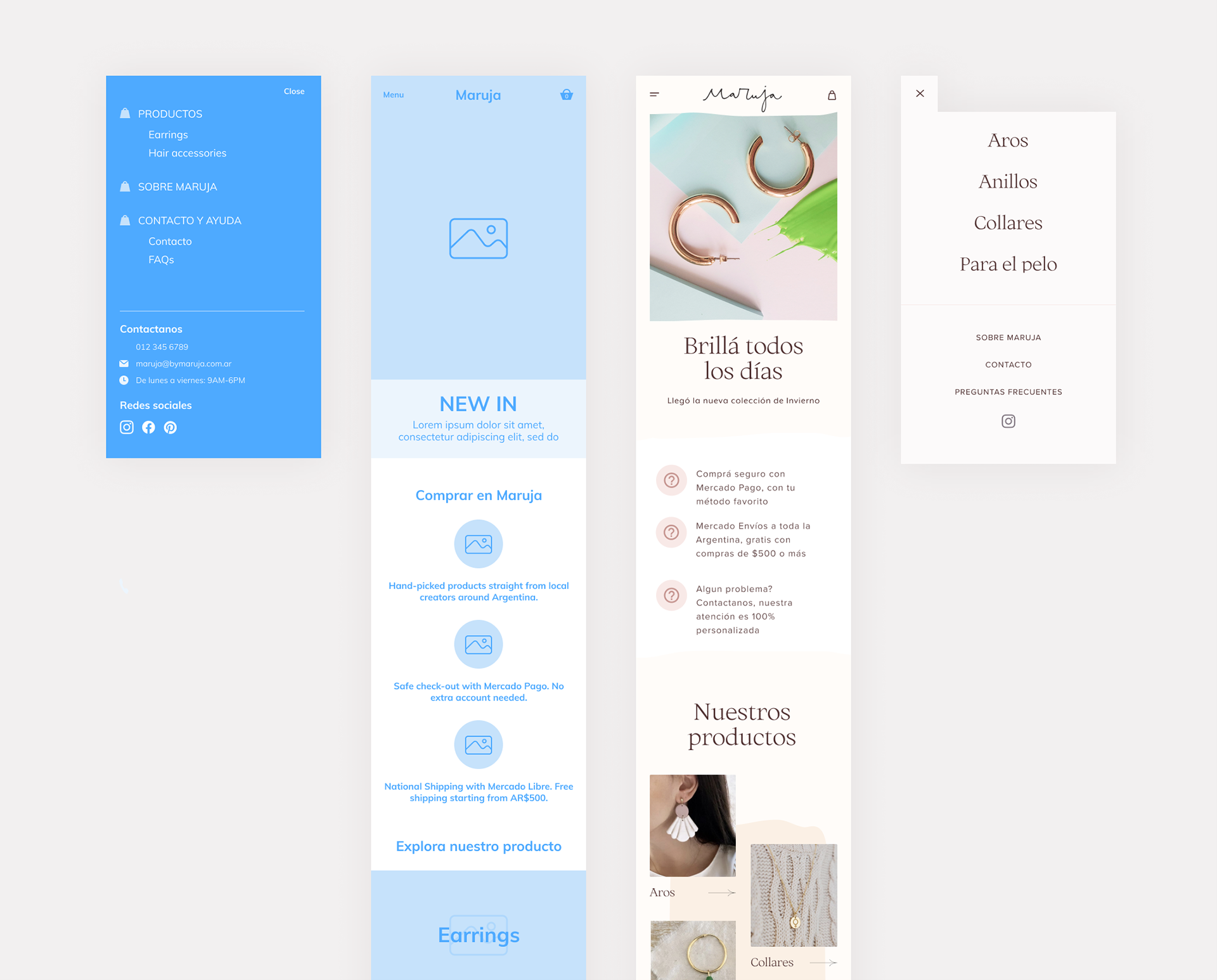
First round of mockups and the results with the main findings applied: Simplified menu (to avoid repeated information), more importance to instagram.
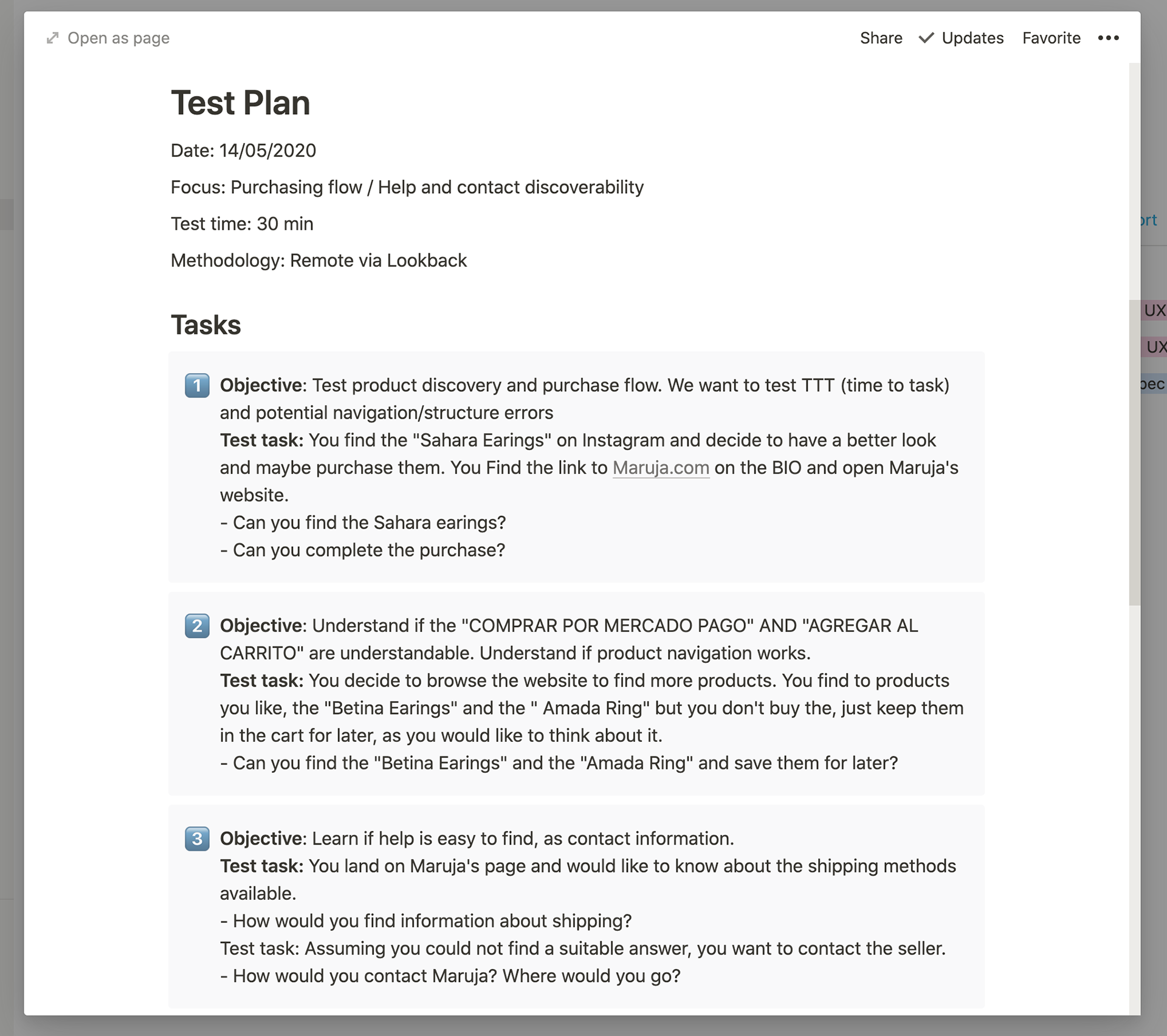
Usability testing: objectives and user tasks
5. Mockups and UI design
We were already working on Figma for the wireframes and loved the team collaboration. We also had experience with it from our formal jobs so it was the best choice.
Maruja approved the visual exploration phase, so now I had to transform the wireframe into a straightforward, beautiful interface that would customers feel the handcrafted warm and simple feeling of a Maruja accessory.
I started from a component base, so I could also create a library of reusable components. Of course, a design system was unnecessary for this simple product, but systematic thinking would take us a long way. It was also helpful to provide the developers with a more transparent structure and standard terminologies.
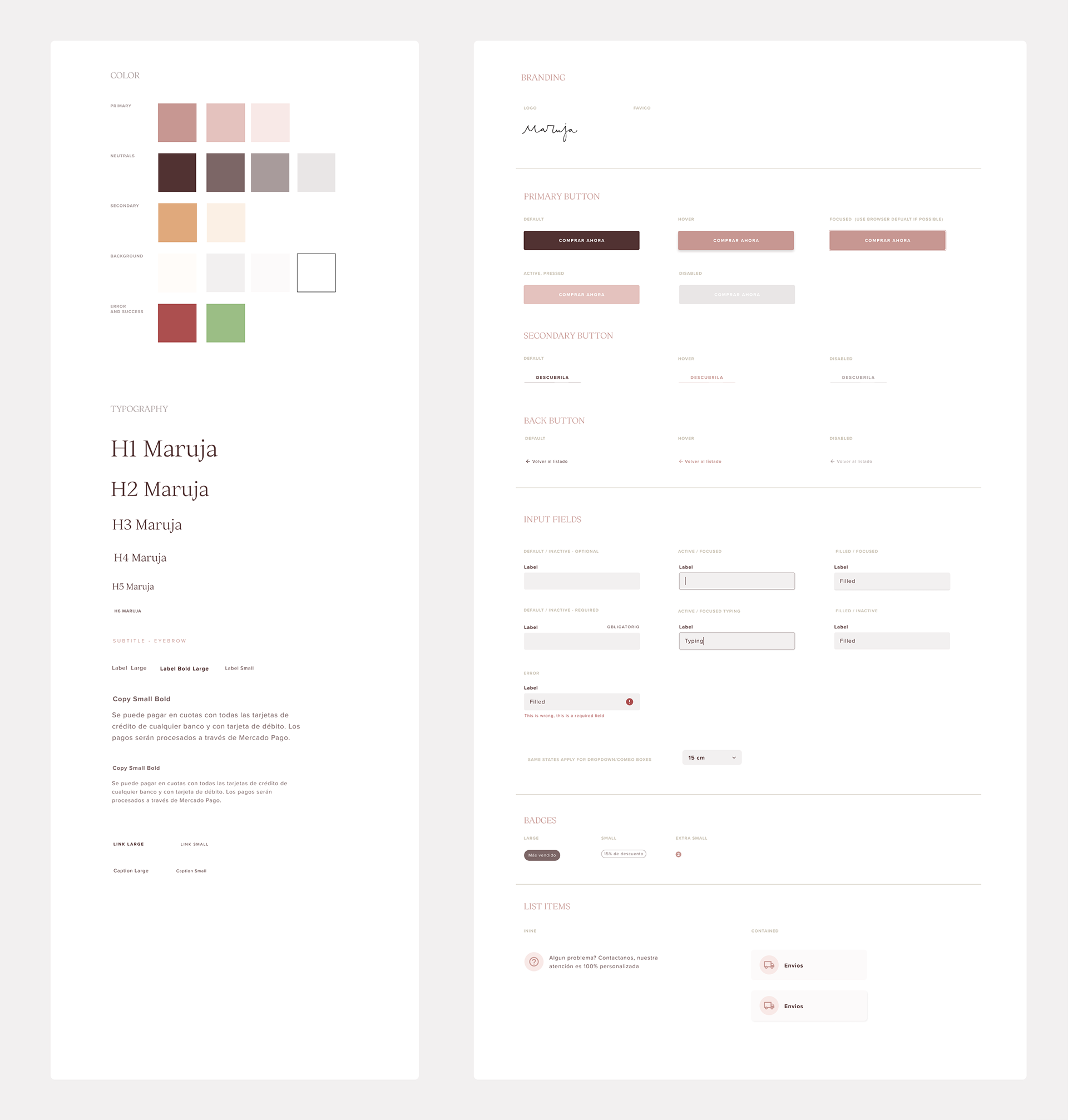
A simple toolkit was the best way to provide the component information plus state description for developers. Here are some of the fundamentals and atom elements. I showed them how to find details and code in Figma so they didn't need instructions to be fleshed out. That reduced the handover time considerably.
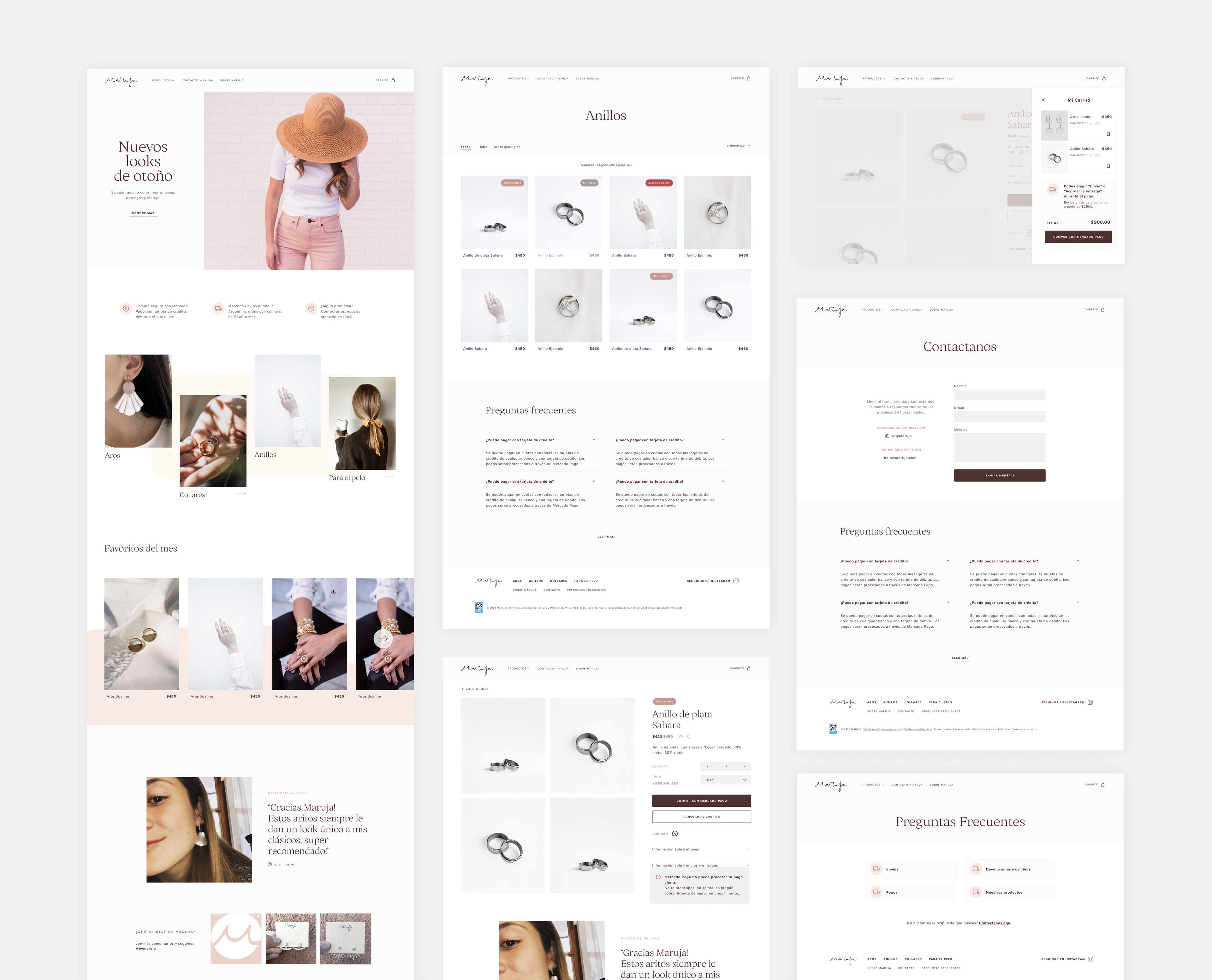
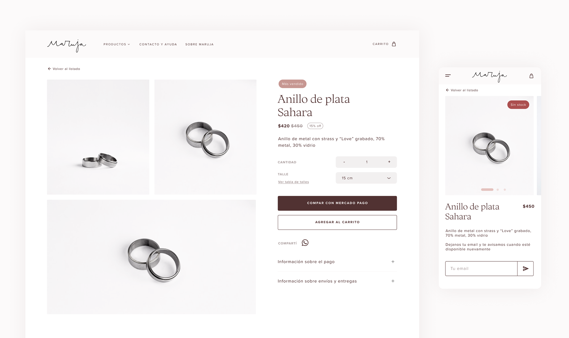
Large version: Home, Collection, Detail, Cart, Contact and FAQs
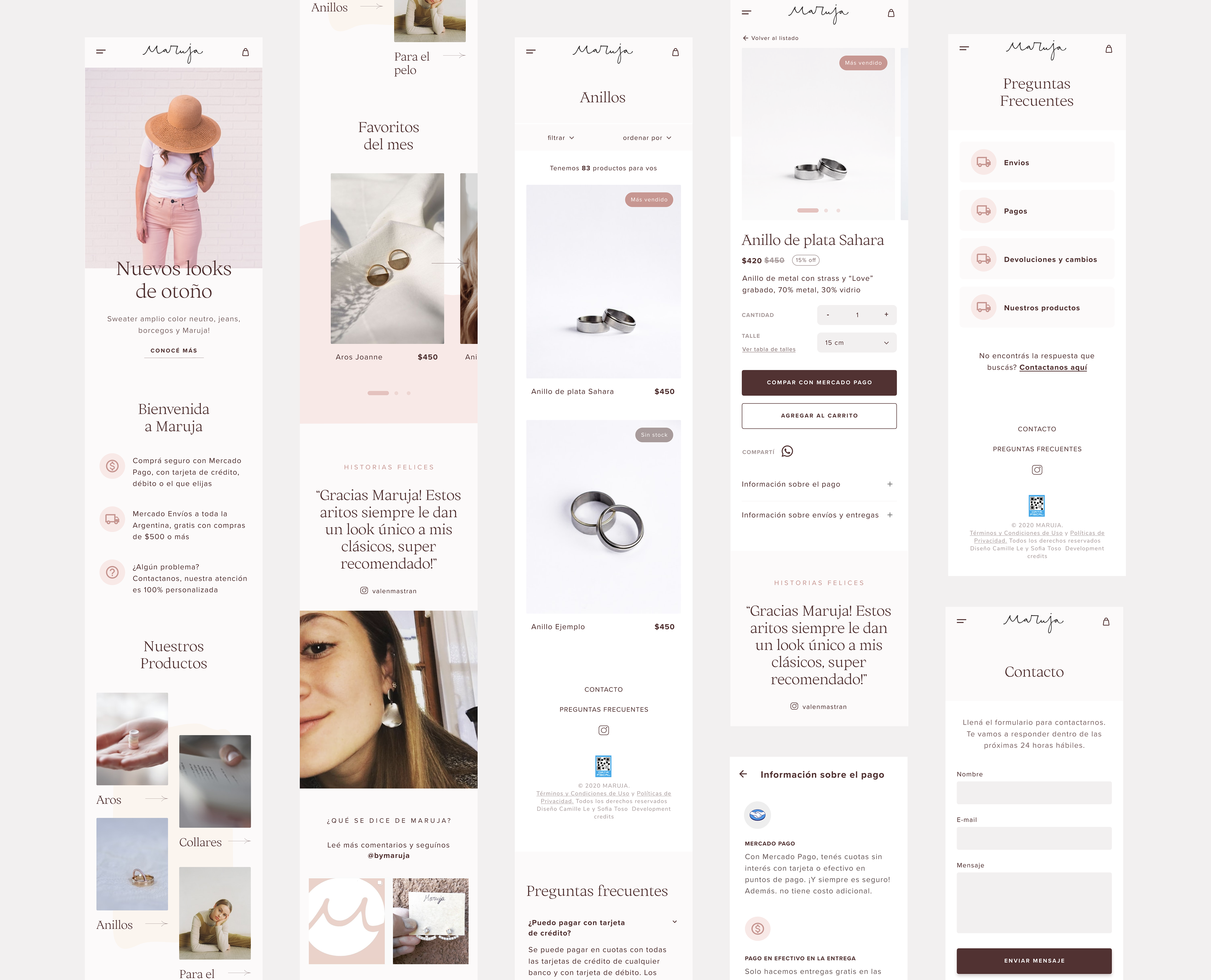
Small screen version: Home, Collection, Product detail, Payment information panel, FAQ, Contact
Results
• The new branding had a significant impact on social media. Engaging in stories is up, and new fans join the page every week.
• The Maruja team is currently loading the page with products. Using the CMS is a life changer. You can see the ongoing results here: www.bymaruja.com
• Maruja's founder loves the website and the experience. She is confident the company will grow thanks to our combined efforts.
• As soon as the new website is filled with content and advertised, we'll track the metrics to measure our success
Learnings
Helping out is, well, no surprise, a rewarding feeling. I'm happy to have helped a business and thankful and uplifted by the generous developers and my pal Camille. They dedicated a lot of time and effort to the cause. I guess my lesson here is a reminder that I can have an impact. I have to pay attention to what happens around me because design can make a difference.
On a professional note, there were also lots of learnings. We struggled with the remote tools for testing, so for the next time: Sofia - don't skip a trial run of the test! Users were empathetic with the technical difficulties, but I'm sure we could have used the lost minutes better.
A significant problem I had was time management; even if there was no hard deadline, I should have been more consistent with the work. Using timeframes in the future during planning will help me stay on track, even if they are estimations without consequences.