From zeros to heroes: A startup's first design system
2020 @Frontastic Product Design
During August 2020, I championed the idea of creating a design system at Frontastic (a SaaS startup in the headless eCommerce industry.) The goal was to speed up our transition from solution to implementation in design and development, build better patterns with our users in mind, iterate faster, and smartly use our resources.
We also wanted to increase usability and maturity perception through our app and lay the ground to switch to a product-oriented brand strategy. I was (am!) convinced it was a company wide initiative from product to marketing and sales and spread the word looking for support.
We also wanted to increase usability and maturity perception through our app and lay the ground to switch to a product-oriented brand strategy. I was (am!) convinced it was a company wide initiative from product to marketing and sales and spread the word looking for support.
My role
Lead designer through end to end process: discovery, research, design, testing and development support through launch
The team
Sanja Mandic and Klaudija Ljevar - Frontend developers
Catherine Jones - Content lead
The timeframe
We worked on a PoC for 2 months (from discovery to a stage 1 release)
We are still working on updates with every iteration
Due to confidentiality, I'm not able to show working prototypes, high quality details, or any information not publicly accessible.
The challenge
I'm fascinated by design systems. I've been following the hype around them for years, and I've been lucky to participate in the creation of some ( I know that the hype is well funded). I've experienced the extensive amount of work they require, the cost, the hours. Still, I also witnessed the benefits, so I was sure Frontastic had reached a point in its product maturity where waiting another year would be too late. I had been doing interviews, usability testings, and field studies; the results and the ideas were there, but we were too slow to act. We were locked into Material UI and developer-oriented patterns that didn't match our personas experience or expectations.
We are a small team, we are constantly firefighting, and it was proving hard not to follow our customers' requests by the book and innovating instead. With little time to pursue change and little resources, I still saw the value of systematic thinking. I needed to make sure we offered a plan that would yield instant results and optimize resources.
The plan
Starting small and preventing scope creep was crucial. To kick off the project, we first choose one key flow as an MVP, to go to management with a concrete idea: I had plenty of data, I had created personas early on, I knew which ones were the most affected. It was clear after mapping exercises that the highest impact and lower risk action was to tackle our page builder first.
I pitched this approach, involving product, engineering, and marketing early on. I invited the teams to join a workshop to uncover the goals we wanted to achieve, the brand attributes we wanted to represent and align on principles. We agreed and set a timeframe of a month for an MVP.
Constraints would guide the way for the following core decisions. The engineering team and I discussed usability and feasibility; we needed to make compromises and set out rules:
• We are building the system at the same time as we maintain our current app. It will be a progressive approach. I was tasked with the creation of the strategy document and tracking our progress. Will the app look strange at first? Yes. Is it going to provide benefits to the company and our users sooner? Double yes!
• We selected Figma as a toolkit tool as it's the best for a clean handover.
• The design would go from component to page (not the other way around). We used an adaptation of atomic design (foundation - components - patterns - templates) to avoid the atom/molecule discussion I've seen in the past. We included a transition sub-library for components that will need hybrid solutions for some time.
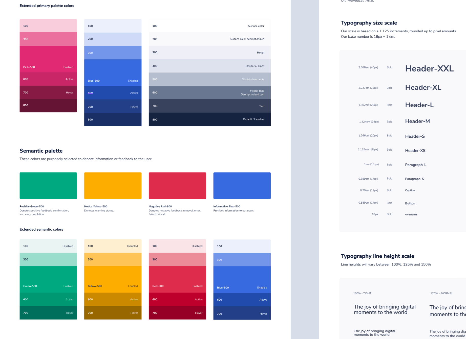
•The toolkit would contain the foundational tokens so the developers and I could speak the same language.
•We decided to keep the component library inside our app as an area behind a feature flag, so our developers can easily access the code and guidelines. An external tool could come in the future.
•We would update the Material UI version we were using and keep conventions for naming and transition components in order of importance and impact.
•We use Notion to keep the copy inventory and brand guidelines available for everyone in the company.
• We selected Figma as a toolkit tool as it's the best for a clean handover.
• The design would go from component to page (not the other way around). We used an adaptation of atomic design (foundation - components - patterns - templates) to avoid the atom/molecule discussion I've seen in the past. We included a transition sub-library for components that will need hybrid solutions for some time.
•The toolkit would contain the foundational tokens so the developers and I could speak the same language.
•We decided to keep the component library inside our app as an area behind a feature flag, so our developers can easily access the code and guidelines. An external tool could come in the future.
•We would update the Material UI version we were using and keep conventions for naming and transition components in order of importance and impact.
•We use Notion to keep the copy inventory and brand guidelines available for everyone in the company.
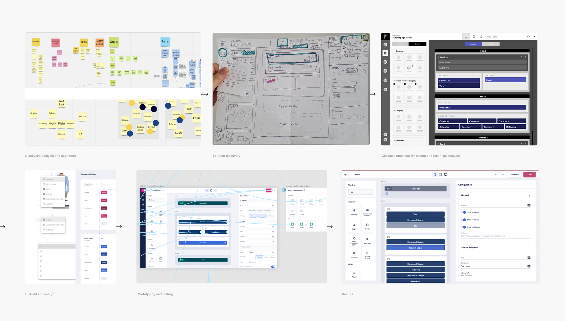
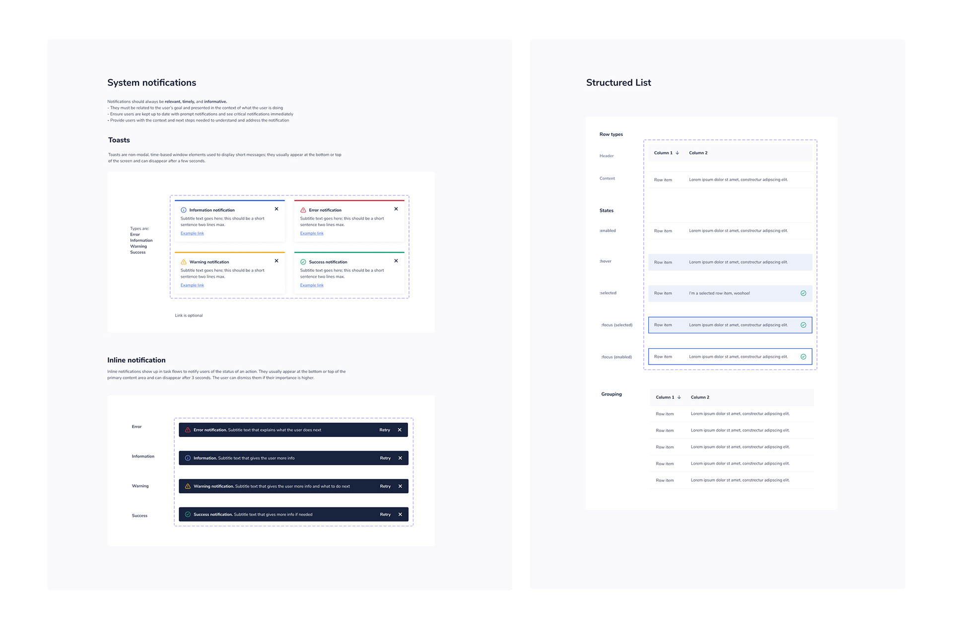
Methods used during the design phase (chronologically ordered)
The execution
We couldn't "build a skateboard" because our users were already using our " decent-working-car." How can we avoid disrupting consistency between areas? The existing (Material UI) patterns were barely fitting our needs, our brand was not represented, and the interface was talking "developer" all over the place.
We concluded that we had to update the perceptual patterns first. Doing this would hold visual consistency while I improved our key flow, keeping the development team busy preparing the foundation. I used our branding guidelines and tested variations internally until we agreed on a look and feel that reflected our tone of voice. I got help from our lead content writer to achieve the best results and get more feedback. The new representation of our product signified some changes in our branding as well. It was essential to tackle the updates in the marketing and sales teams, but that's another story.
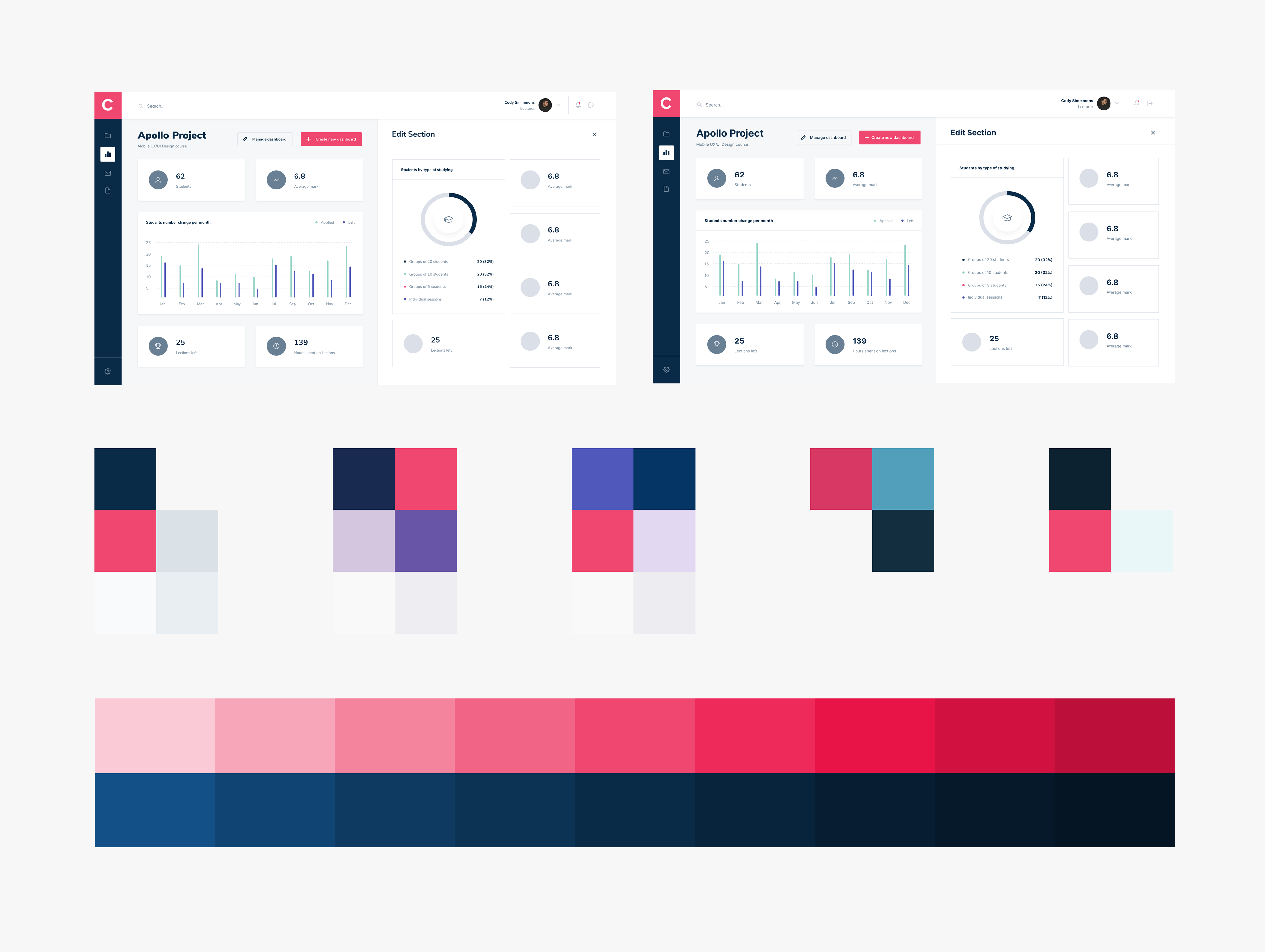
Visual experiments with typography, shapes and colors.
UI and pattern audits
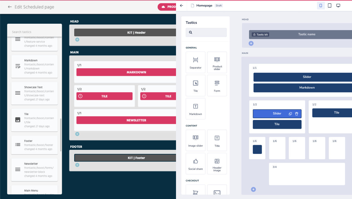
I conducted a UI audit to identify units and patterns that comprised the page builder. Our app was inconsistent, so I needed to thoroughly inspect every crack to ensure that whatever solution we came up with would make sense in other areas.
I went from fundamental components, like buttons and inputs, to patterns like search and modals. It helped me understand the logic behind the system's behavior and compare it with our ideal conceptual model. After finishing the audit, I separated the components and patterns into tiers, working from the least inconsistent and most used first and ending with the most consistent and least used.
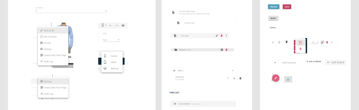
A slice of the UI audit with the main components to tackle for the first stage of the design: dropdown menus, cards and buttons
Designing new patterns
I started working on the page builder flows using the data I had collected from field studies, interviews and previous usability testing. I went from greenfield ideation to a more constrained thinking to find the right spot. I tested the results internally with new hires (which was an easy, quick and-not-so-dirty way to get input) and consulted feasibility at every step of the way. After two iterations, we had a solid new page builder we could redesign in a short amount of time.
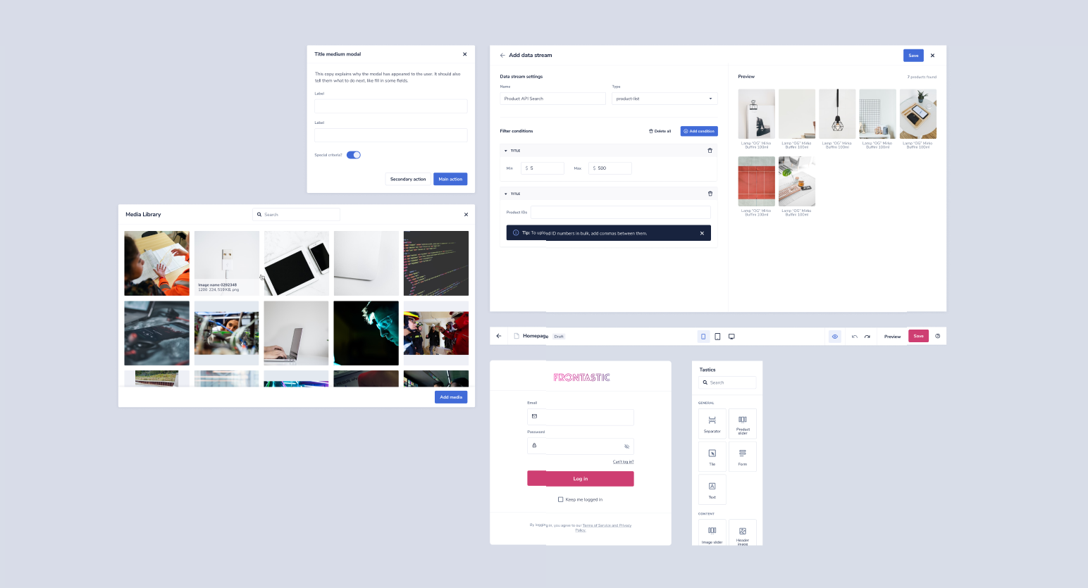
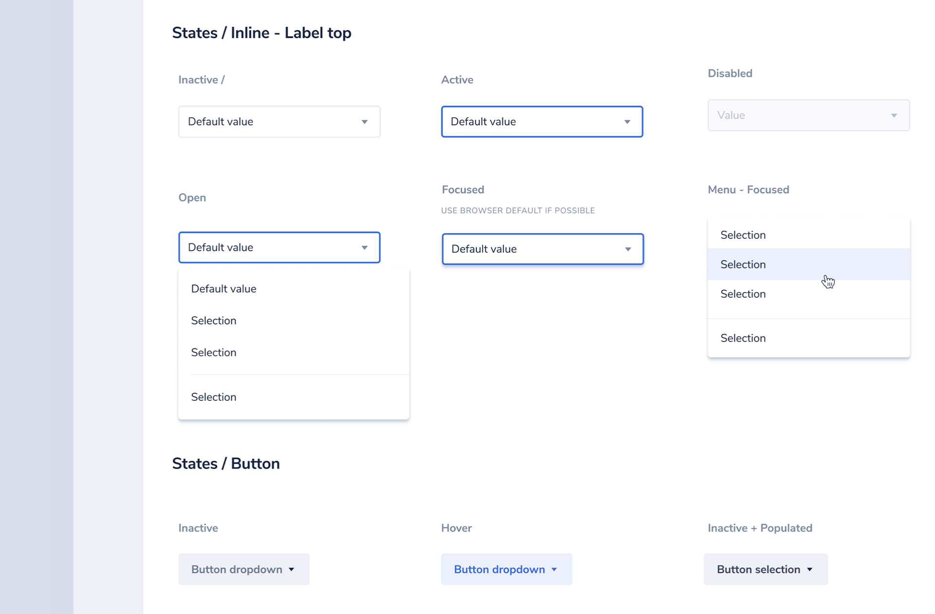
I redesigned the most used patterns like modals, search, forms and the navigation and panels inside the page builder. I integrated them in a Figma Toolkit.
Some of the components required for the next iterations. I've used Figma variants to make the toolkit easier to use.
After stage one was launched (and the results were noticed and celebrated), we went back to our daily business. But this was not the end of the initiative. We were done with the foundation, but a design system needs to be maintained and improved; we had more stages to achieve a complete change!
We now work with Jira stories, connecting product and solution briefs. In this way, we can grab the next piece of the design system that makes the most sense to impact our business results in every iteration. This is also helpful because we don't have a dedicated team and we don't want the design system to be understood by the company as a one-time project but as an ongoing investment.
Results
• Design time was cut by more than 50%. My time can be spent finding problems and thinking of the best solutions instead of re-inventing the wheel.
• As a team, we spend less time going through design files and redlining.
• We can improve and deploy new features in less time; we went from weeks to days.
• The developer's happiness has increased. They perceive they have more impact on the product and are proud of the results.
• Our application is now unique, coherent, and visibly more mature. The value and usability perception of our users has increased.
• Sales reported positive feedback from pitches, and our marketing communications are crisper: we reflect a product that has been thought of from a human perspective.
Learnings and acknowledgements:
I heard it before, but it was never more true: design systems are never finished. We are not even half way there, but the results are so strong that everyone is happy we dared to think big but start small. I don't think every company needs a design system. They can be a little overrated. But if you plan on working in a big application that is based on another design system that doesn't work for you, you need to follow the same rules in order to win.
This achievement wouldn't have been possible without an amazing team of developers helping me out, not only in execution but as a real design team: giving feedback on flows and components, trying to step out of their comfort zones and actively campaigning to get the green light to continue adding more and more code to our library. Even if it seems unnecessary from the outside, they are the first ones to say: "Maybe we can incorporate this one now", or "let's demo this this way". Thank you Sanja Mandic and Klaudija Ljevar!
This achievement wouldn't have been possible without an amazing team of developers helping me out, not only in execution but as a real design team: giving feedback on flows and components, trying to step out of their comfort zones and actively campaigning to get the green light to continue adding more and more code to our library. Even if it seems unnecessary from the outside, they are the first ones to say: "Maybe we can incorporate this one now", or "let's demo this this way". Thank you Sanja Mandic and Klaudija Ljevar!
Old editor vs new editor - First iteration
All the components are incorporated in code inside this same application with the use guidelines so developers can grab the code right away.
All the components are incorporated in code inside this same application with the use guidelines so developers can grab the code right away.